


The Color of Creativity: From Bauhaus Theory to Digital Analysis
Written by Francesco Rocchi
The Bauhaus movement’s disciplined investigation of color as a technical and emotional device forever changed how art was understood in the early 20th-century. These legacy traditions are being extended in remarkable ways by new technologies today. This paper investigates how computational colour analysis of QuantumSpace extends the foundational theories of Wassily Kandinsky and exposes subliminal patterns in artmaking based on art-inspired mathematics of map of colour relations. We illustrate how modern technology is capable of deciphering the psychological aspects of the use of color in art, thereby pursuing the spirit of Bauhaus, as carried over into new realms of art authentication, preservation and the study of creative mind, through the analysis of Kandinsky’s “Impression III (Concert Test)” (1911).
Quantumspace technology makes use of 3D RGB color mapping, capturing the distribution of individual hues in volumetric space to form a psychological “color fingerprint” for a given artist. Results show that Kandinsky used a unique color volume consistently across works, even when particular hues varied the relationships among colors and the distributions of the colors in the luminosity spectrum are consistent. Further the artworks exhibit repetitive patterns in the use of blue landmarks as compared with the more restricted flavours of red. This study extends the methods of analysis developed at the Bauhaus, giving mathematical depth to color usability and chromatic patterns, therefore showing computational analysis to be capable of disclosing artistic patterns at the threshold of human perception.
Introduction : When Colors Tell Stories
In 1888, two revolutionary artists lived together in Arles, France. As Vincent van Gogh and Paul Gauguin shared a small yellow house, they also shared something less visible but equally profound: their approach to color. A recent computer analysis of paintings from this period shows an astonishing fact, Van Gogh’s style shifted slightly to include some of Gauguin’s most common color schemes. The mathematical signature of their relationship seems to be hidden in the painting itself, barely perceptible to human eye for more than 100 years and then discovered by means of a sophisticated color mapping technique.
This is just the beginning, soon we will unveil endless possibilities in how new technologies can reveal elements of artistic composition which even the original makers could have been unaware of. It represents a turning point in the evolution of color theory that began with the Bauhaus movement –continuing a journey from philosophical inquiry to mathematical precision while preserving the essential humanity of artistic expression.
From Philosophy to Algorithm: The Bauhaus Legacy
The Bauhaus school fundamentally changed how we think about the role of color in art and design. Established in 1919 by Walter Gropius, it was formed as a bold experiment that united artists and designers in the pursuit of radical new ways of fusing art, craft, and technology (Droste, 2019). One of its most important members, Wassily Kandinsky, theorized about the nature of color, stating that colors did not only serve as visual impressions but also were capable of exerting psychological forces in their own right, capable of evoking distinct emotional feelings.
“Color is a power which directly influences the soul,” Kandinsky wrote in his 1911 treatise “Concerning the Spiritual in Art,” developing a systematic approach to understanding how colors affect human psychology (Kandinsky, 1911).
What Kandinsky observed with artistic intuition, today’s technology can now measure with mathematical rigor. Quantumspace technology, for instance, enables comprehensive analysis of an artist’s creative signature, revealing how artists unconsciously embed personal elements through their color selection and mixing techniques, opening up a whole new field in analyzing artwork.
The Birth of Computational Color Analysis
QuantumSpace’s journey began with a simple question: could an artist’s mind be mapped through their artworks? Francesco Rocchi’s foundational research explored the methodology for mapping an artist’s cognitive patterns through artwork analysis, extracting behavioral data from brushstroke characteristics to determine physical painting habits and artistic methodology. This initial inquiry evolved into a sophisticated system extracting over three million data points from each painting.
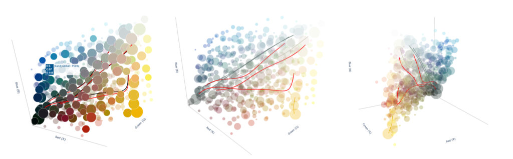
The most direct information we can extract from raw pixels is the global color fingerprint. In its simplest form, this fingerprint consists of a count, for each color in the RGB space, of the number of pixels sharing that color within the image, regardless of their physical location on the canvas. In practice, however, we first normalize brightness and contrast to ensure meaningful results. In the reports the algorithm produces, visualizing this information in two ways: a 3D plot showing, for each color channel (red, green, and blue), the distribution of color intensity (Fig.1 – Impression III Concert Scatter Plot); and, what we call the color gem: the smallest 3D convex shape containing all the colors present in the artwork (Fig.2 – Impression III Concert Gem).
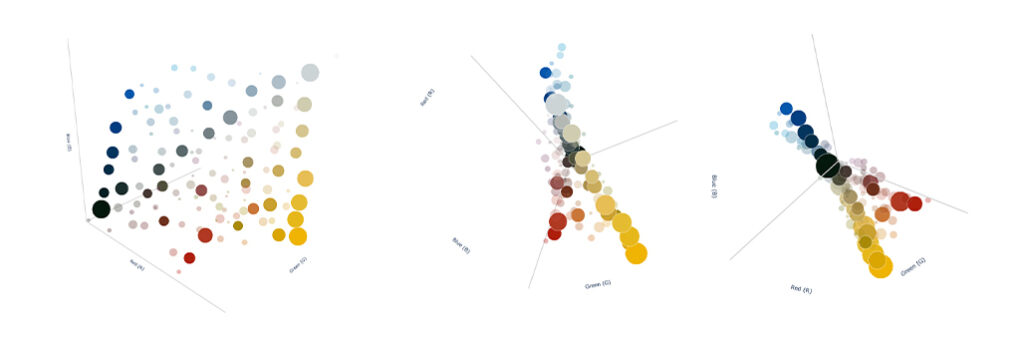
Wassily Kandinsky – Impression III concert – Scatter Plot
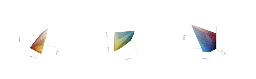
Wassily Kandinsky – Impression III concert – Color Gem
Through Kandinsky’s Eyes: ‘Impression III Concert Test’
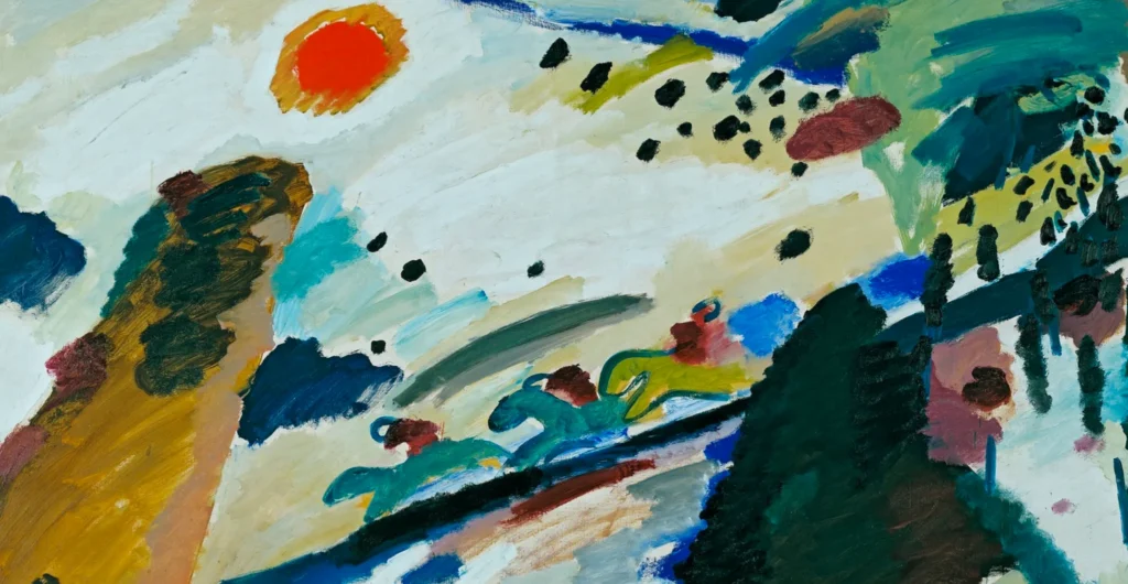
Take Kandinsky’s 1911 “Impression III (Concert Test)” for example. Made at a critical moment in his evolution toward abstraction, this vibrant painting captures his emotional response to an Arnold Schoenberg concert that profoundly affected him. What makes this painting particularly significant, is that Kandinsky had synesthesia himself, a neurological phenomenon in which stimulation of one sensory pathway leads to automatic, involuntary experiences in a second pathway (van Campen, 2008). For Kandinsky, musical notes triggered specific color perceptions. The yellows, reds, and blues of “Impression III” weren’t merely aesthetic choices but his literal visual experience of Schoenberg’s atonal compositions. This painting represents a rare case where an artist documented his direct neurological response to sound through color (Ione and Tyler, 2004). QuantumSpace’s analysis can thus reveal patterns in not just artistic choice, but actual sensory perception.
Computational analysis uncovers fascinating patterns in Kandinsky’s use of colors. The most arresting colour is a vivid yellow (RGB: 241, 200, 54) dominating the right half of the composition. Mathematical analysis confirms what our eyes intuitively feel – this yellow creates an immediate focal point, drawing the viewer’s gaze and radiating energy throughout the piece.
The three largest colours in terms of area used in the design are shades of yellow (hex code: #F0B503, #E9C03C, and #E6B81C) and make up 35.8% of the canvas in total (12.08%, 11.19%, and 12.54% respectively). However, when we look at the scatter plot we can see a surprising aspect of Kandinsky’s use of blue. Yellows may prevail by surface, but Kandinsky’s blues are many and subtle – there are far more of them than his reds, which are still confined to very precise shades.
The analysis reveals Kandinsky’s selective color palette approach: a restricted red spectrum utilizing specific preferred tones, contrasted with an extensive blue spectrum demonstrating deliberate chromatic exploration. This selective approach to color range – expansive in blues, restricted in reds – creates a particular psychological tension invisible without computational analysis.
Perhaps most remarkably, when these colors are mapped in three-dimensional space, they create a distinctive volumetric shape, what QuantumSpace calls the “color gem.” Somehow this form stays the same for Kandinsky in this period of his art even though the actual colors differ. It’s like a type of psychological fingerprint, specific to the artist that can be found as consistent through his production (Fig. 3 – Kandinsky’s production color usage).
The most astonishing fact is that across multiple artworks, this space does not change (Fig. 4 – Kandinsky color trends and shading patterns). Even if the colors change inside the painting, the space within they are included remains the same. This consistency becomes not only an invaluable asset for educational purposes but also a powerful authentication tool; when a supposedly authentic painting shows colors outside this characteristic volume, it immediately raises questions.
Wassily Kandinsky – Various Artworks – Color Usage
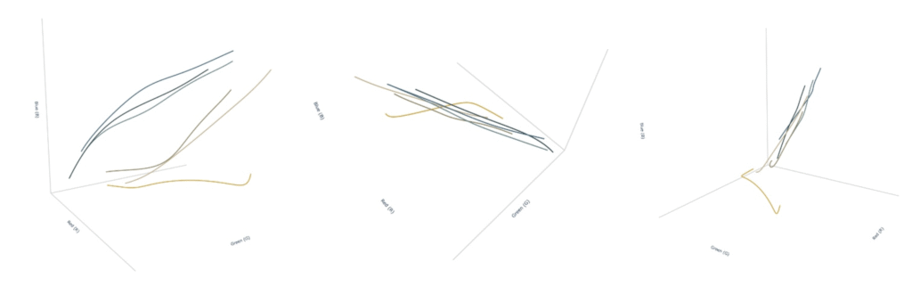
Wassily Kandinsky – Various Artworks – Color Trends
Beyond Authentication: New Ways of Seeing
While authentication applications are compelling, the technology’s ability to reveal the psychology behind artistic choices may be its most profound contribution. The analysis shows how Kandinsky’s distribution of highlights (24.66%), midtones (47.88%), and shadows (27.95%) creates a balanced visual rhythm peculiar to his work.
More intriguing still are the “eye catching” places – regions where the mathematical model suggests that the audience’s attention will settle. In the “Impression III Concert Test,” one especially brilliant red accent is entirely independent from the painting’s main color associations.
It is something that our mind tells us subconsciously, but now we can have a scientific reason for it, a series of numbers describing the relations between that specific color and the rest of the painting. This mathematical validation of artistic hunches exists between the realm of science and creativity and gives a solid and clear description to every single element of an artwork.
The technology transforms how we experience art, making it interactive and immersive but also measurable. Users can explore every detail, uncovering nuances that are invisible to the naked eye and confront color relations and compositions across multiple productions.
Conclusion: Continuing the Bauhaus Vision
The Bauhaus school aspired to integrate art, craft and technology, and to dissolve the boundaries between creative practices. QuantumSpace carries on that tradition, applying mathematical rigor to aesthetic understanding without robbing art of its emotional force, it is new light to explore the depths of the artistic research with a better grasp on its single components. The study of color started thousands of years ago, the Bauhaus gave philosophical structure to it, and these new technologies are now building over what other people did before them. We are moving towards a future where the mystery of art will be explored like never before, merging philosophy, psychology and data science to map the components of creativity itself.
This method carries on the Kandinsky legacy by continuing the analytical tradition he could have only dreamed was possible at the time. In probing these new frontiers of color analysis, we discover that we live up to the promise that his theories suggest , that color is not merely a visual element but a dramatic theme that stretches our minds to give us a view of the events of the world.
References
Droste, M. (2019) Bauhaus 1919-1933. Köln: Taschen.
Galassi, G. (2025) ‘Digitalization of Artworks’. New York: QuantumSpace.
Ione, A. and Tyler, C. (2004) ‘Neuroscience, History and the Arts: Synesthesia: Is F-Sharp Colored Violet?’, Journal of the History of Neurosciences, 13(1), pp. 58-65.
Kandinsky, W. (1911) Concerning the Spiritual in Art. Munich: R. Piper & Co.
Kandinsky, W. (1911) Impression III (Konzert). [Oil on canvas] Munich: Städtische Galerie im Lenbachhaus.
Martino, F. (2025) ‘Computational Color Analysis in Art Authentication’. Journal of Digital Art History, 4(2), pp. 78-92.
Van Campen, C. (2008) The Hidden Sense: Synesthesia in Art and Science Cambridge: MIT Press.
Related Posts:
QuantumSpace – Towards a new phenomenology of the digitized artwork
We present you QuantumSpace, with a selection of excerpts and quotes from our C.E.O. Alberto Finadri and our C.O.O. Francesco Rocchi. Discover how we shaped our unique solutions, spearheading developments in the field of AI.
Automating Aesthetic Intelligence: the Usability of Advanced Data Extraction
An in depth analysis underscoring the urgent need for the development of an automated system dedicated to the extraction of complex, multi-layered data, and the creation of a specialized database with a robust, automated framework.
Color Signature Extraction and Regional Analysis for Artistic Imaging
We showcase the capabilities of our advanced color analysis system, providing valuable artistic insights into both composition and focal points, and delivered to the user in digestible forms like color palettes, dominance maps, and interactive 3D plots.